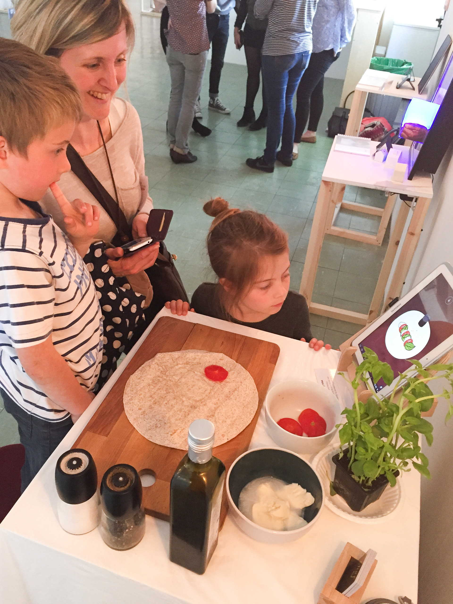
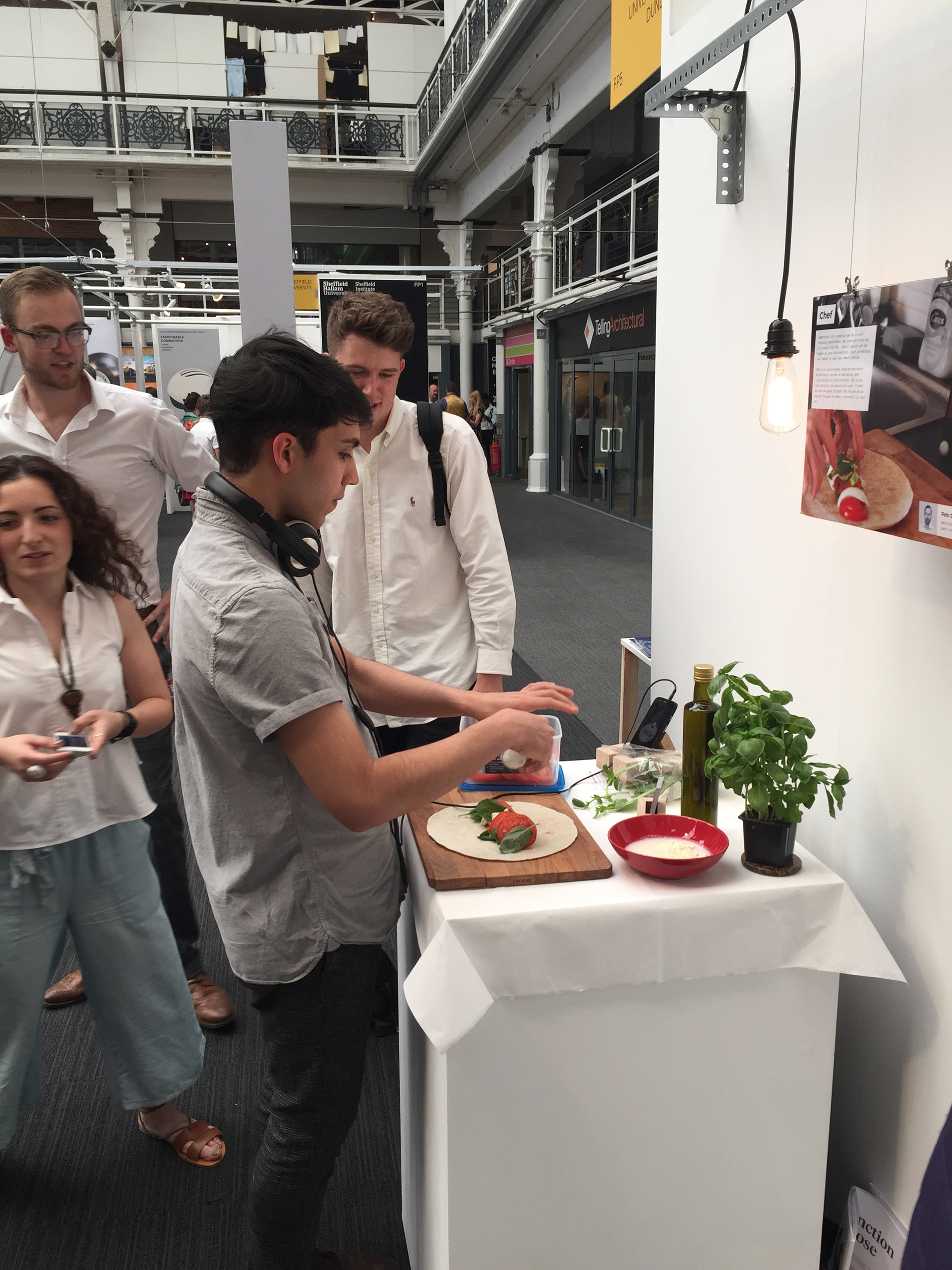
Immersing into cooking can be a very relaxing experience. We stop worrying and just enjoy the flow – which should not be broken by any distractions, such as washing your hands to use your smart device.
Chef began with user research – observing people cooking in their home environment and looking at weak spots of their interactions with digital devices.
Research participant Jana making some fresh sushi
MK1 Prototype evaluation with professors Chris Lim & Graham Pullin
Branding of chef uses a warm yellow colour, bringing the much needed enthusiasm into cooking. Paired with earthy, soily brown that reminds us of the soil from which all the vegetables come. Working in art college canteen and seeing big ladles all around, its shape made it into the actual logo.
Animations were chosen as an abstract way, giving freedom to users and preventing their fear of not being perfect when they cook. They were produced by drawing over photo and vectorising the drawings with Adobe Capture.
Illustration process – tracing paper, sharpie & Adobe Capture
Illustrated ingredients and elements used throughout the designed recipe
These illustrations were then brought to Adobe Animate, where I made them move. After some time, I figured a workaround how to explore them and keep them in HTML5 Canvas, sharp animation even in the app.
Animations for the individual steps of the recipe (magnify to play)
Screens of the web application prototype
Chef was exhibited at DJCAD Degree Show 2016 in Dundee and New Designers 2016 in London, receiving good feedback for its educational potential.


If you'd like to read more about chef, here is the project brochure: http://bit.ly/2gDNvHX